Creating a reusable bilingual document experience that meets regulatory requirements without disrupting onboarding.
problem
A bank-wide document widget designed to help English-speaking clients in Quebec access required legal documents in bothEnglish and French, while keeping the onboarding experience clear, accessible and easy to navigate.
Role
Lead Product designer & content designer
company
RBC Royal Bank of Canada
duration
4 months
setting
Bank-wide designers + product and legal
Regulatory Document Widget
The Regulatory Challenge
Balancing Compliance With User Trust
Quebec regulatory requirements meant certain legal documents had to be presented to English-speaking clients in both English and French with equal weighting. The challenge was to satisfy those requirements without overwhelming users, creating unnecessary concern or disrupting the application journey.
Equal Language Weighting
English and French legal documents needed equivalent prominence within the experience
Unexpected French Content
English-speaking clients could encounter French content despite having already selected English astheir preferred language.
Growing Document Volume
Some journeys included fiveor more documents, meaning bilingual requirements could significantly increasethe amount of content presented.
Driving a Bank-Wide Design Direction
I coordinated input across nearly 50 designers representing different use cases, then led a focused six-person working group through heuristic evaluation andsynthesis. This helped turn a broad regulatory challenge into a shared design direction that could scale across teams and onboarding experiences
problem
Compliancy is not always the best user experience
All Contract of Adhesion(CoA) documents must be provided to English speaking clients in Quebec, in both French and English. Both language offerings must be "equal weighting". Disclosures must also be included.
Contracts of Adhesion(CoA) are documents that provide legal terms associated to a product that a client must agree to. All documents for various products were classified as CoA or not CoA to guide product teams.
process
What do these requirements look like for the user?
Since all requirements came from legal there was less wiggle room as interpretation of legal requirements also had to be considered.
Met with design group that represented their various spaces across the bank - about 50 designers, which proved to be challenging. Since I was a content designer and visual designer with the credit and lending space, and familiar with working with Bills and our legal partners, I was asked to take the lead.
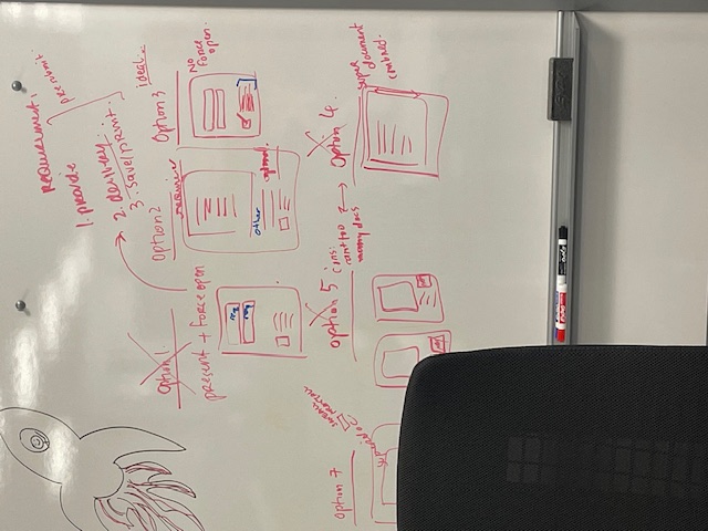
I gathered all the various use cases across teams and found underlying similarities to help solve for next steps and refining the requirements in first step drafts to start the Discovery process.
heuristic problems
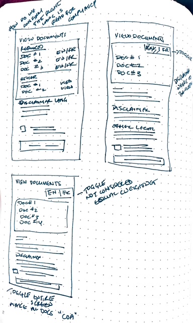
Created a team of six designers to conduct a heuristic evaluation on requirements and lo-fi sketches . Once the evalution was completed, we did an Affinity Mapping exercise to see where there were common concerns to address in the final design.
heuristics #1
system status
English speaking users have selected their preferred language and will not be sure why there is French language information on the screen. This will make them lose trust in the information, process and bank.
heuristics #2
Match Between the System and the Real World
The disclaimer text in French and English agreeing to seeing documents in English is very confusing in an application instead of in their profile settings
heuristics #4
Consistency and Standards
Do users have to read the document in both languages to be considered "read"? Are we compliant if they open the French document but dont understand French?
heuristics #8
Aesthetic and Minimalist Design
Some use cases have 5+ documents. Seeing the double amount of documents can overwhelm a client
Solution
HMW seamlessly incorporate the documents in French language without causing confusion?
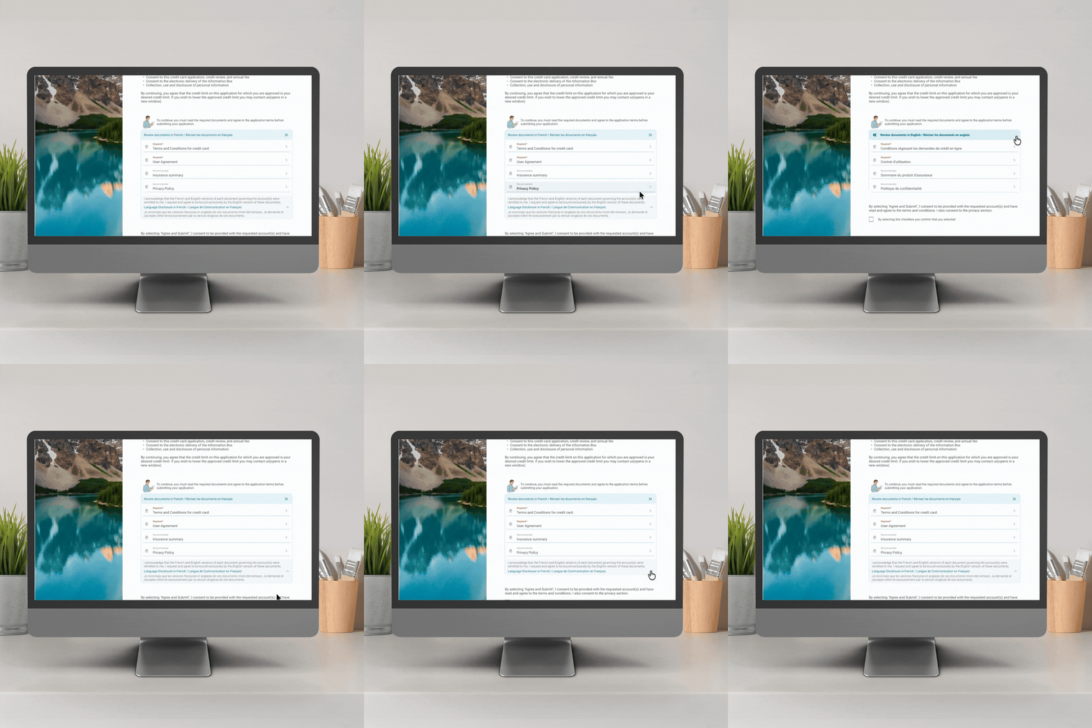
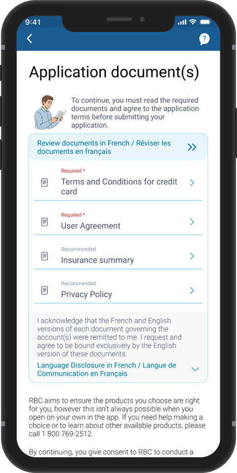
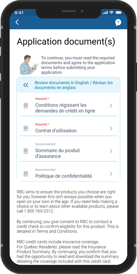
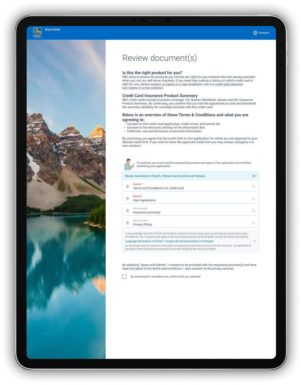
Having the user toggle between French and English was the first solution, however that was not considered "equally weighted". Instead, I contained the documents in their own space on the page and added a "switch" for the documents only, to go from French to English and vice versa. Legal allowed this option, however they did not want to use the word "switch", so they provided the content used.
Minimized interruption for the user by only limiting the language switch component for Quebec residents. For all French speaking users in Canada and all English speaking users outside of Quebec, they will see their documents in preferred language only.
Regulatory Document Widget
Heuristic Insights
Where Compliance Created UX Risk
I led a heuristic evaluation that revealed four areas where regulatory requirements could undermine clarity and trust.
System Status
English-speaking clients could question why French content appeared after they hadalready selected English as their preferred language.
Match with the Real World
Bilingual disclaimers introduced within an application could feel disconnected from how clients expected language preferences to work.
Consistency& Standards
It was unclear whether users needed to open both language versions to satisfy legal and compliance requirements.
Aesthetic & Minimalist Design
Journeys with five or mored ocuments could effectively double the visible content when both languages were presented.
Regulatory Document Widget
Core Design Decisions
Designing Compliance Into the Experience
I turned complex legal requirements into a clearer, scalable interaction model through three key design decisions.
Solution
HMW include legal French content on an English-language screen and not induce worry?
Prevent alarming users - distinct translation accompanied with specific interactions, guide users to understand what the French content meant on their English language screen. This also supported accessibility concerns. Disclaimer content - I utilized the Gesalt Principle of Proximity and contained the disclaimer directly with the documents instead of with the other legal disclaimers that will be on this screen. This will help with ensuring it is implemented correctly across the bank and support context for users. French translation of the disclaimer, is set to default collapse which forces the user to interact to expand it. This would help to understand it was not a priority and that it is a direct translation of the English content. Switch content to move between languages - the direct translation was included to avoid standalone French content. User switches to the French documents - no legal disclaimer is included since the disclaimer states that the user wants to "request and agree to be bound exclusively by the English version of these documents". That would not apply if the user completed the Document Review with the French documents. Limitation – This screen is part of an application flow so avoided introducing the Profile language settings, since that would prevent them from completing their application, so deemed it out of scope.
Solution
HMW ceate a reusable component that is scalable with minimal cognitive overload?
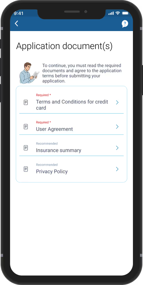
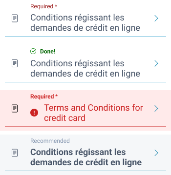
Since the number of documents for onboarding experiences differ and will continue to grow, the management of documents between Contracts of Adhesion (CoA) and non CoA, need to require less management from the product and engineering standpoint. Therefore, I decided for all documents to be managed the same. This will be easier for the user and easier for engineering and product.
Submit Application - This supports the opening and "reading" of required CoA documents. The user is able to submit the application with the French documents or English documents. However, the application can only be submitted if the associated documents on the UI has been read.
Keep language choice contextual
Rather than changing the client’s overall language preference, I kept bilingual documents within their own space and introduced a dedicated control for moving betweenEnglish and French. I applied this only where the regulatory requirement was relevant, minimizing disruption elsewhere.
Reduce anxiety around unexpected legal content
I positioned legal guidance directly within the document component, while using progressive disclosure for translated content to reduce visual noise and help clientsunderstand why French content appeared within an English experience.
Design one reusable document pattern
I brought Contracts of Adhesion (CoA) and other document types into a consistent interaction model, reducing complexity while supporting different regulatoryrequirements, onboarding journeys and document volumes.
Regulatory Document Widget
Key Interface Screens
From Decisions to Experience
How bilingual legal requirements translated into a clear and reusable document experience.
Document-Level Language Control
Bilingual documents remain accessible without changing the client’s broader language preference.
Contextual Legal Guidance
Supporting content stays visually connectedto the documents it explains.
Reusable Document Pattern
A consistent interaction model supportsvarying document types and volumes
Regulatory Document Widget
Design System & Scale
Scaling the Widget Across the Bank
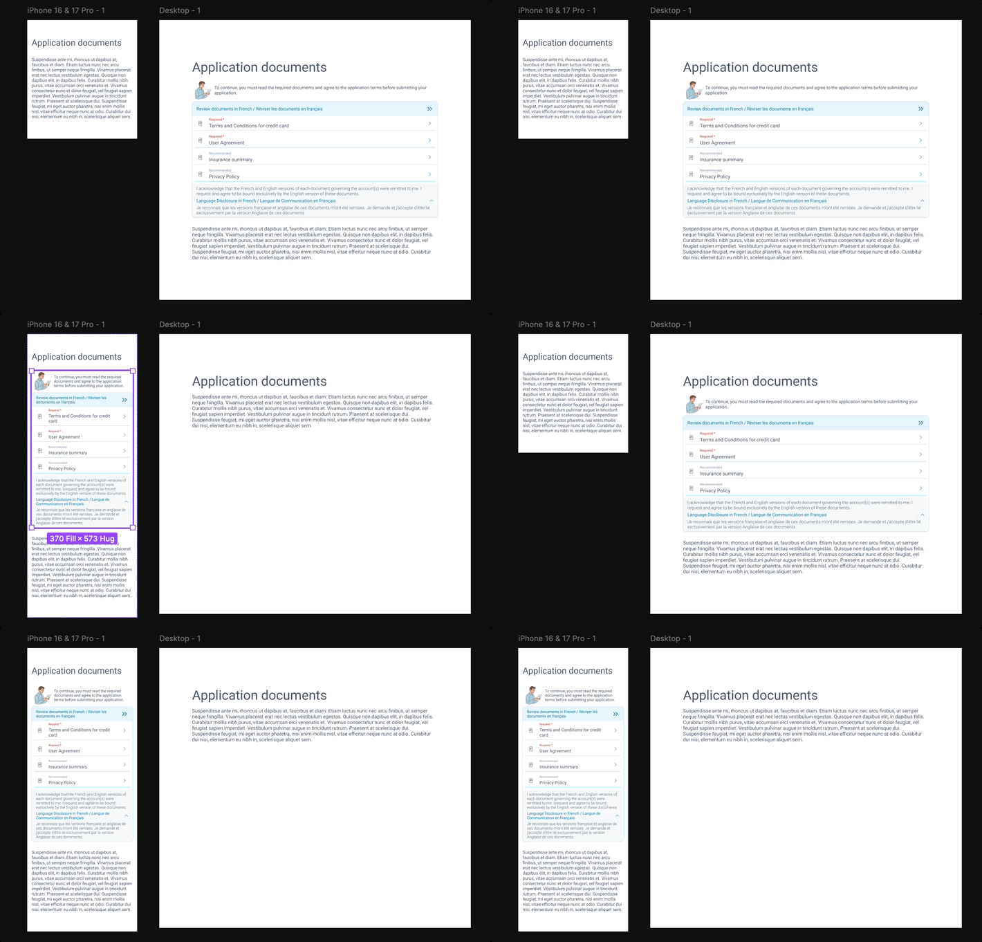
To support bank-wide adoption, I translated the document widget into a reusable system with responsive behavior, clear layout guardrails andstandardized design tokens, reducing implementation ambiguity while maintaining consistency across experiences.
Responsive by Design
I defined responsive typography and device modes to help the component adaptacross desktop, tablet and mobile while preserving readability and hierarchy.
Defined Layout Guardrails
I established minimum and maximum widths, spacing rules and sizing constraints tocreate clear boundaries for how the component behaves across different layouts.
Standardized Tokens & States
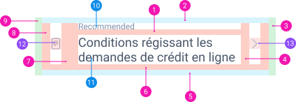
I defined spacing, typography, icon and component-state tokens to give design andengineering teams a consistent foundation for implementing the widget across products
Enforcing modes & tokens to maintain consistency
Responsive
Responsive font sizes allows for component to adjust based on designated device modes (desktop, tablet, mobile).
Mid and max width
To preserve layout and readability on different screen sizes; min and max widths have been established.
Since implementation the Bill101/96 has been implemented in numerous onboarding flows across the bank. As seen here, the component is added without any disruption to the rest of the document review screen.
Successfully established a bank-wide regulatory design standard for Bill 101/96. By designing a flexible, reusable component rather than a one-off screen, I enabled multiple product teams across the organization to achieve compliance with zero design debt.
Streamlined the implementation process for subsequent product launches, allowing engineering teams to integrate the component into various onboarding journeys without requiring custom UI work.
Despite adding significant legal requirements and French/English document toggles—traditionally high-friction points—data post-implementation showed no impact on drop-off rates.
The solution ensured 100% compliance with Bill 101/96, protecting the bank from significant financial penalties while maintaining a "delightful" and fluid user experience.
Successfully advocated for the use of expand/collapse interactions to manage cognitive load, preventing the English-speaking user from being overwhelmed by unexpected French legal text while still meeting the "equally weighted" legal requirement.
Ensured the multi-language component met WCAG 2.1 AA standards, specifically solving for screen reader behavior when transitioning between English and French content to prevent user disorientation.
A Bank-Wide Standard With No Added Friction
Meeting regulatory and accessibility requirements while creating a reusable foundation for future onboarding experiences
100%
Regulatory Compliance
Met Bill 101/96 requirements while reducing regulatory and financial risk.
0
Drop-off Impact
No measurable drop-off impact despite added bilingual legal requirements.
WCAG 2.1 AA
Accessibility Standard
Supported screen-reader transitions between English and French content.
Bank-Wide Adoption
Deployed across multiple onboarding flows as a reusable regulatory standardwith zero design debt.
Faster Implementation
Engineering teams could reuse the component in subsequent launches without custom UI work.