< Back to Work Experience

Credit Card Offer

Year
2022
Role
Design, and supported research
Team
Credit Cards, Consumer Banking
Channel
Mobile App - Webview

What is it?

Clients that have been with the bank for 60 days or more, with no credit card from this bank and are eligible for a pre-approved credit card and credit limit.  Based on the current information the bank has on file, including their income, employment and credit standing.  

Problem

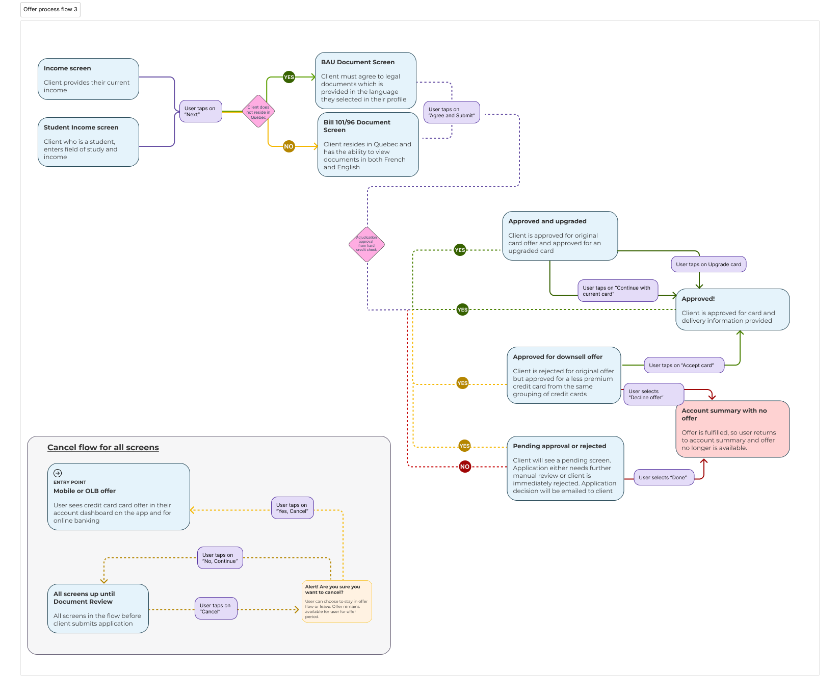
This is a pre-approved offer, but clients are required to confirm income and employment and are subject to an adjudication process where they will have to agree to a hard credit check for approval. Only one card is available in the offer and after the adjudication, some clients may be eligible for an upsell or downsell credit card, depending on the initial card they were offered and if it belongs to a family of cards.

HMW encourage clients to feel comfortable with a pre-approved offer that requires adjudication to fulfil the offer?

Design Process

Exploration - this included knowledge shares with business, engineering and architecture, experience mapping and secondary research. Secondary research involved looking at other financial institutions and also looked at similar concepts internally. Leveraged  previous research for similar flows/concepts, as well as live data that existed for those concepts, which helped guide the direction taken with TPA.
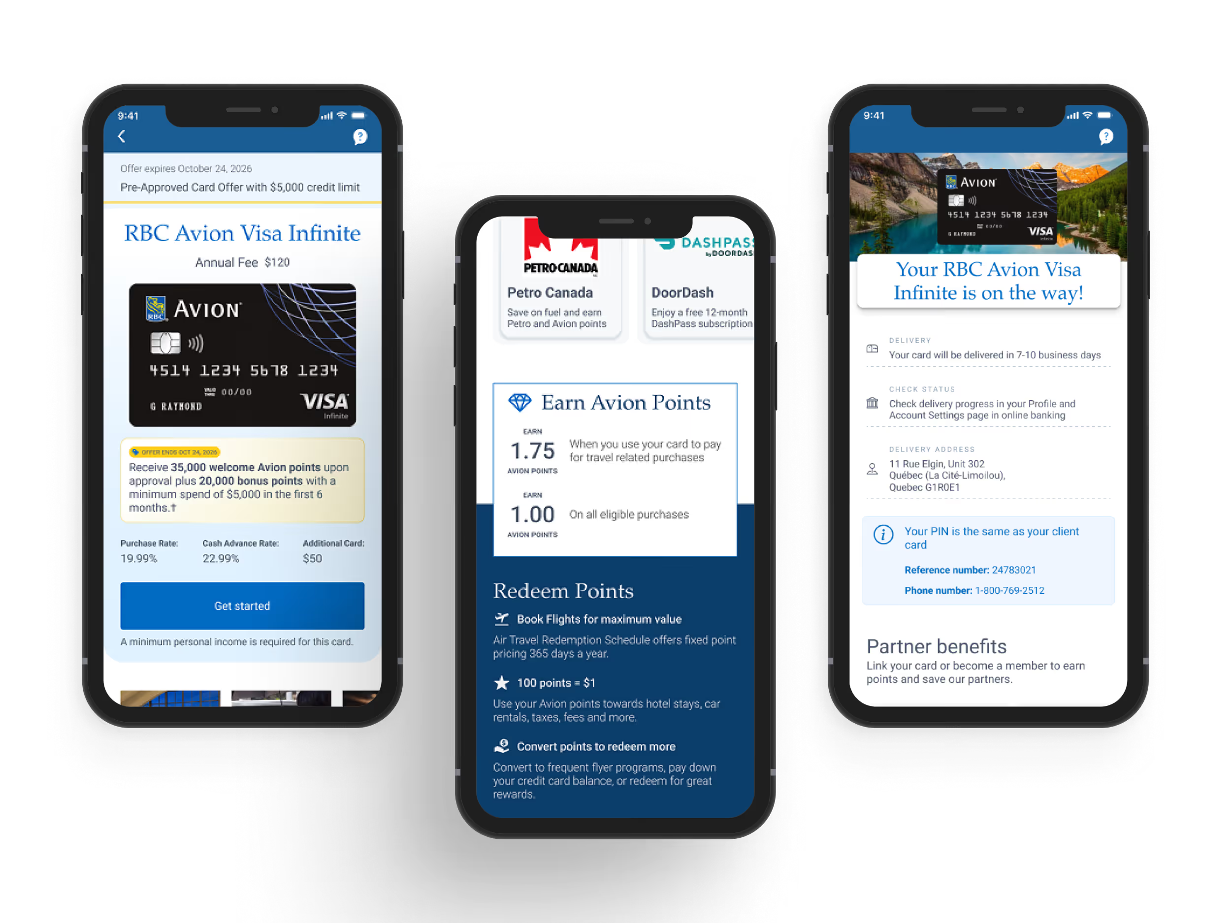
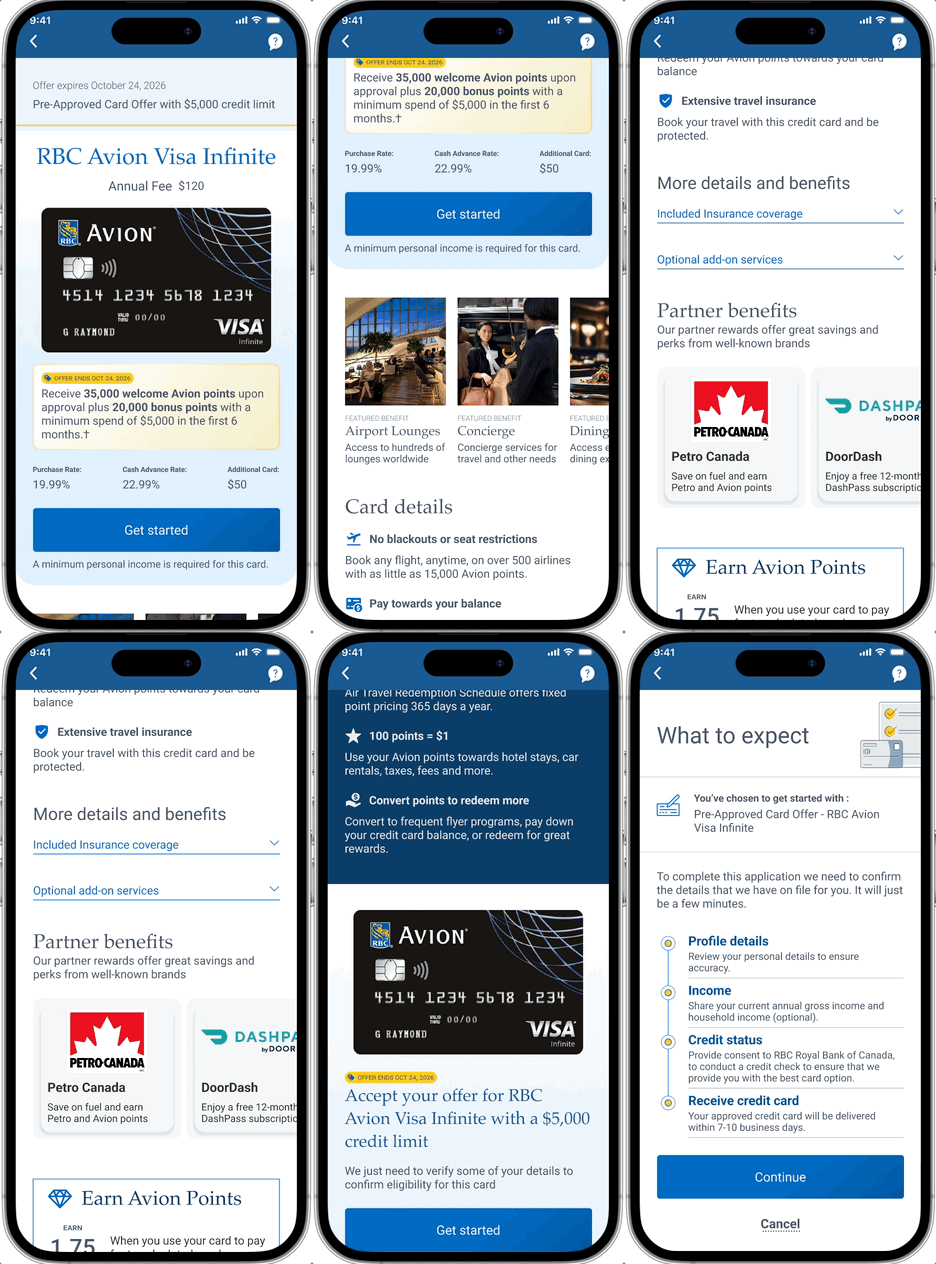
First iteration design - this can be see below using RBC design library. Below shows the "happy path" where a user enters the flow, and is approved for the card they were targeted for, initially. This was shown to internal stakeholders
User Testing - Together with a lead researcher, we put together research questions and then conducted the moderated interviews, which we analyzed together with the lead researcher and shared with stakeholders.
Final Design - using the findings from the research, the final designs were developed and shared with stakeholders. Further iterations of the final design were incorporated to include legal requirements (numerous Bills) as well as various technical limitations that were discovered in the initial design stage or when development began.

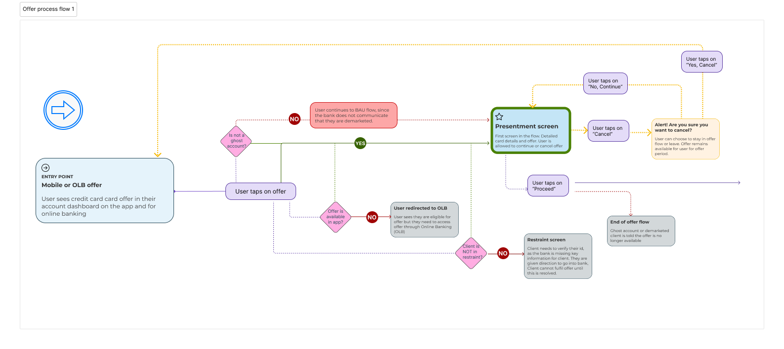
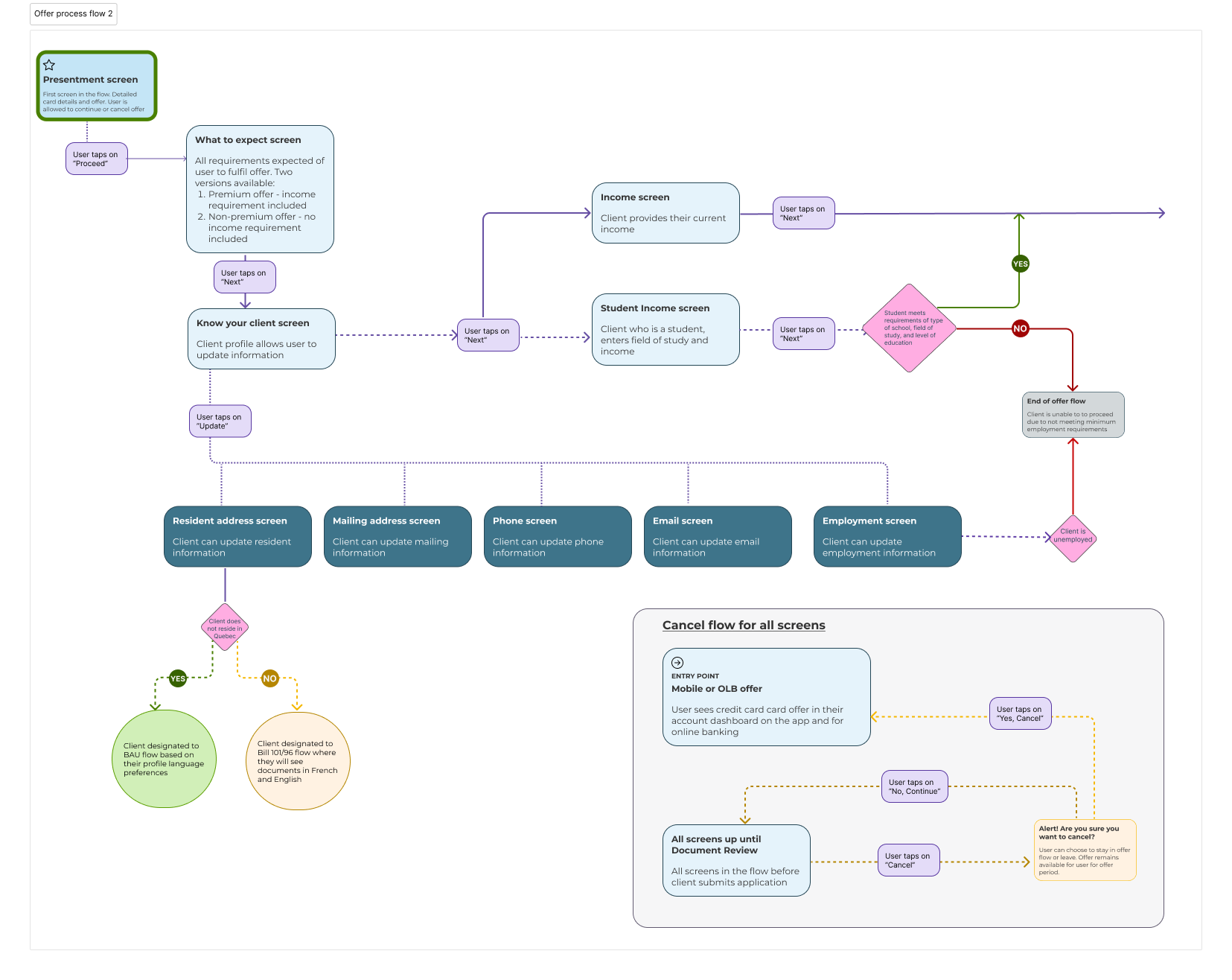
Experience Map

First Iteration Design

First iteration TPA design

Research Findings

Misleading

Users felt misled by the term Pre-Approved and as it did not align with their expectations. This was further emphasized by the "Apply" CTA, as users thought that they would simply just have to accept the card and that would be it. Solution - pre-approved, is a term used across the bank, therefore removing the term was a problem beyond our work. Therefore, emphasis in seeing the value of the card through the content was emphasized. Also the term "apply" was removed and instead messaging around moving forward was used.

No Interest
Users felt underwhelmed by "Using your Rewards". They felt it sounded like marketing and did not bring any tangible benefits that came with the card Solution - Removed this and replaced with a more tangible benefits, which is mentioned further down.
Overwhelmed
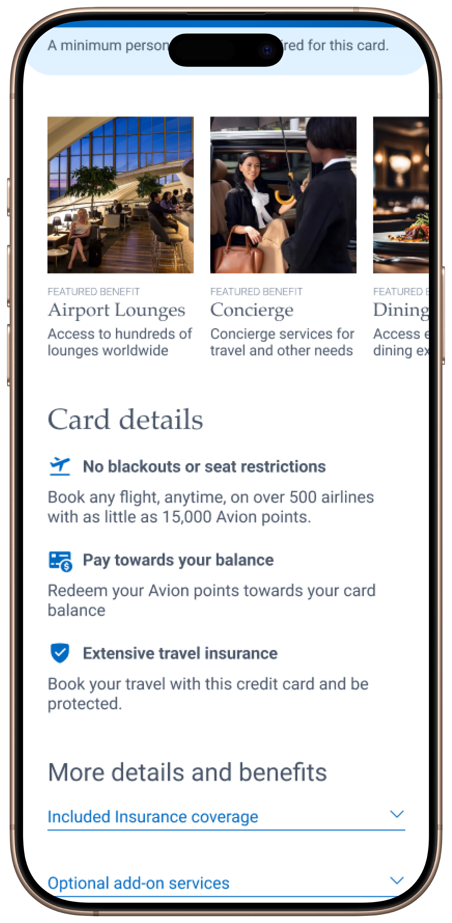
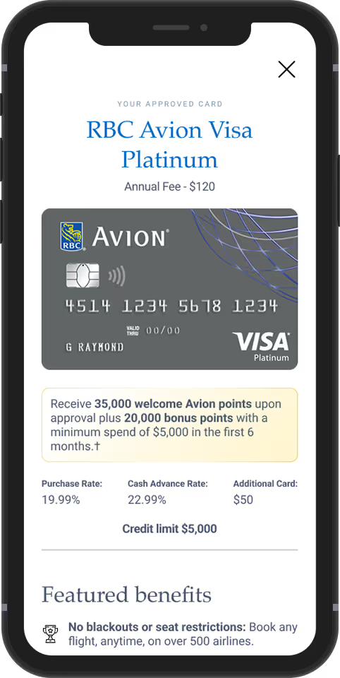
Users felt they only wanted tangible benefits. Benefits that they had to work towards did not appeal to them. Solution - Balancing user needs and business needs provided direction in how to remove information but also how to ensure meeting business needs for certain information. A clear separation in the layout allowed offer content to be separated from actual features of the card.
Trust
The team expected users to be turned away by the credit bureau check, however, users who were versed in credit in Canada, understood it is part of the process and associated it to RBC looking out for their customers and ensuring they were eligible to take on the proposed credit limit and credit card.
Hopeful
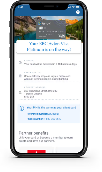
The "what to expect" screen, met users expectations and relieved their initial apprehension. The next steps and the idea of the bank simply confirming their information was expected.
Decision Maker
Users were very interested in Partner Benefits, which was the very last screen. This component had a positive reaction from all users and they all mentioned that it was a deciding factor. Users mentioned that they would have liked to have seen it at the very start on the Presentment screen. Solution - Partner Benefits was mentioned on the first screen. Brought in the Partner Benefits component to the "Approval" screen and changed the layout to a tile visual as Partner Benefits is expected to grow with more Partners over time.  

Final Design

Upsell Card

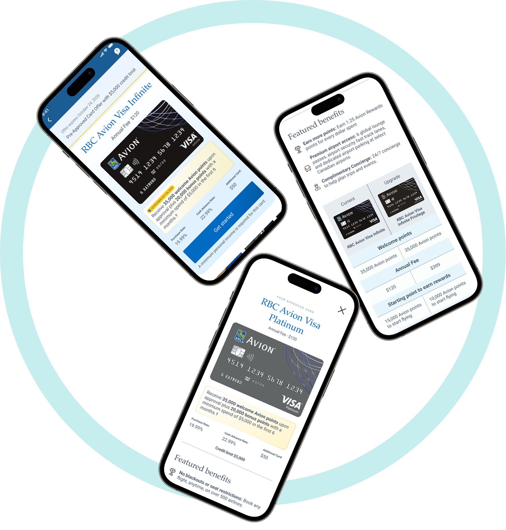
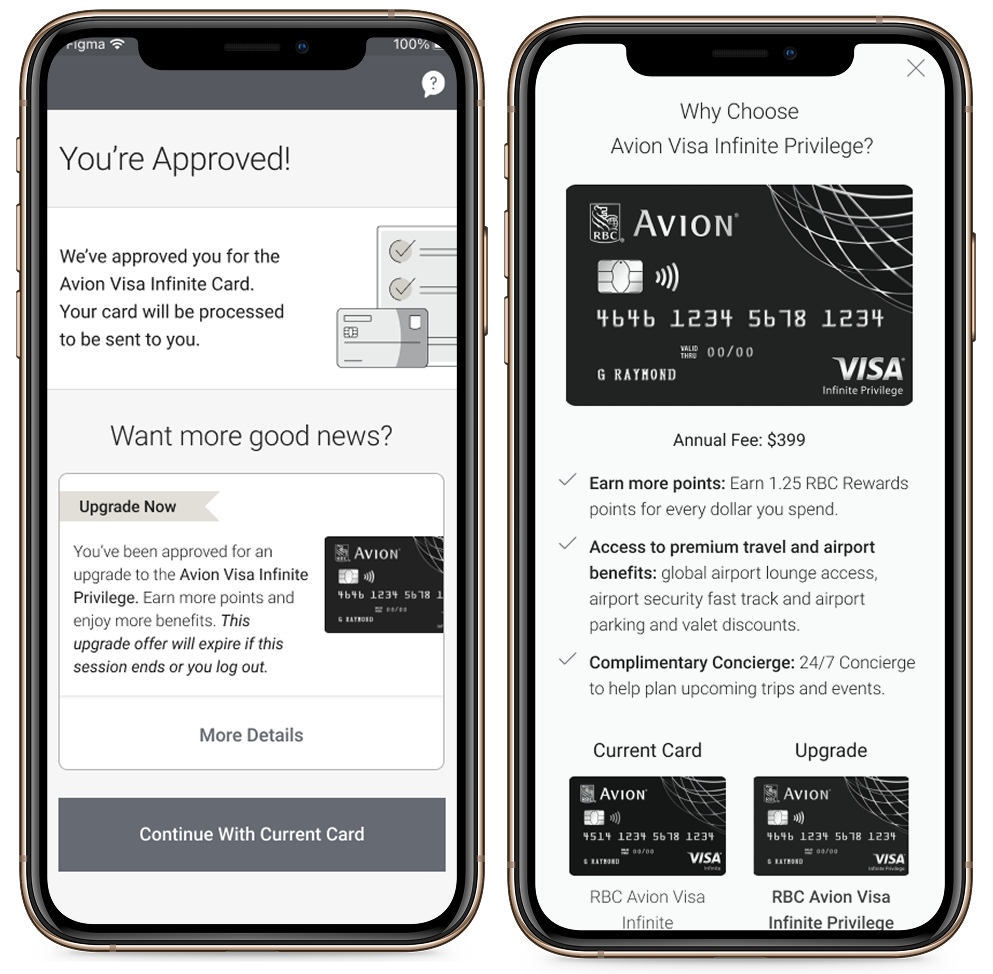
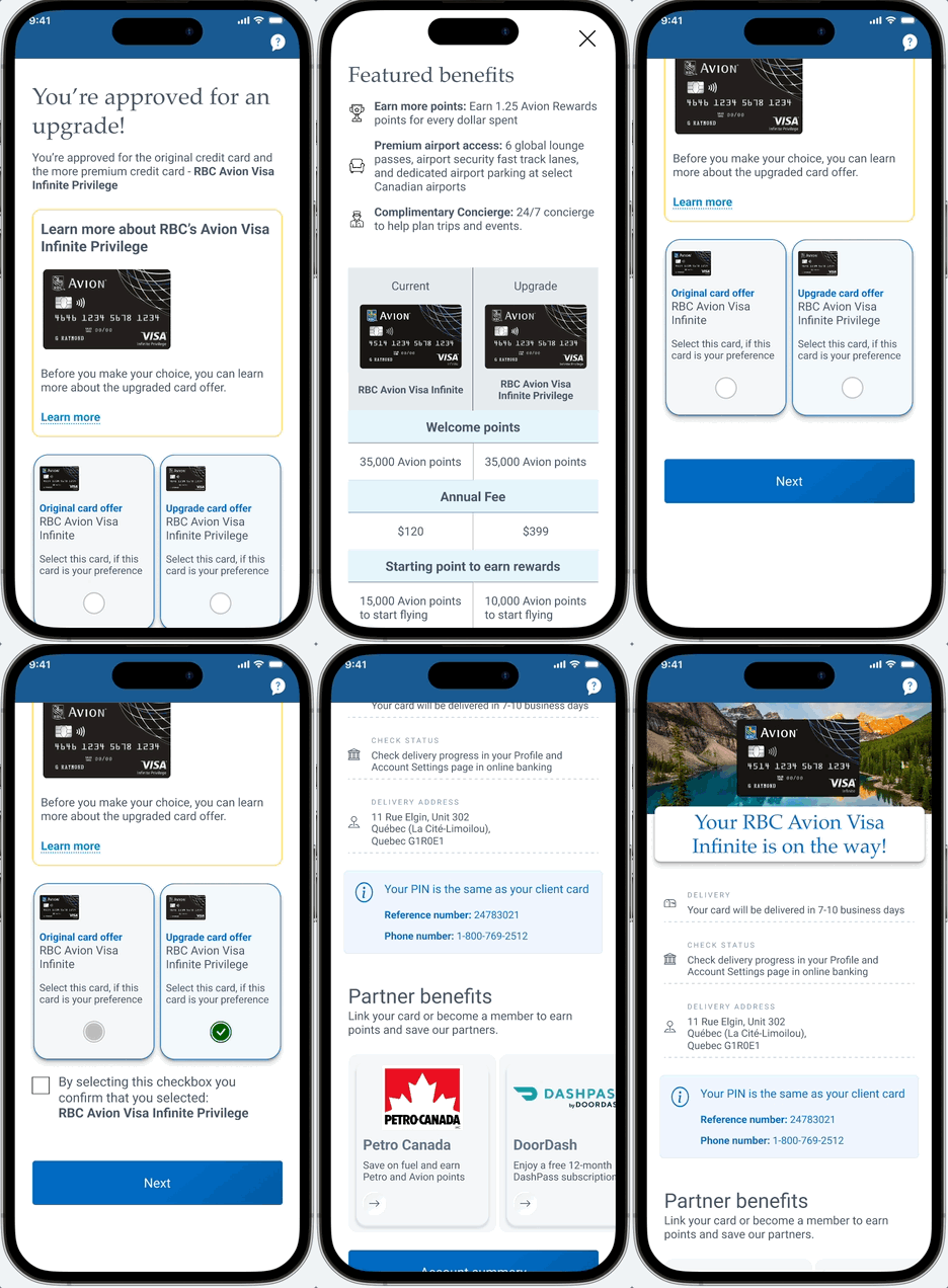
For this pre-approved offer, there was a use case for users to be approved for a more premium card than the card they were approved for. While not all offers will have an upsell scenario, the few cards that did often come with a considerably higher annual fee. In looking at this, we came to the conclusion that we need to fully emphasize the value of that increased annual fee to encourage a user to accept the upgraded card over the current card.

To achieve a richer value proposition, a compare approach and emphasizing the premium features of the card were implemented.

Upsell pain point - users are being taken in a different direction from where they initially started in our flow. Due to that, we could not have the user go directly to the upsell scenario without an explanation. We were also cognizant that we wanted to maintain user control and freedom. Therefore, we included an upsell intercept screen, prioritizing the user's natural path over the upsell card.

Research - this screen did exceptionally well in user testing. Users loved the compare high level view and felt they were confident to make a decision. Users suggested this compare feature be used in the first offer screen, however due to business and technical limitations, we do not show multiple cards in our true pre approval at this time.

Downsell Card

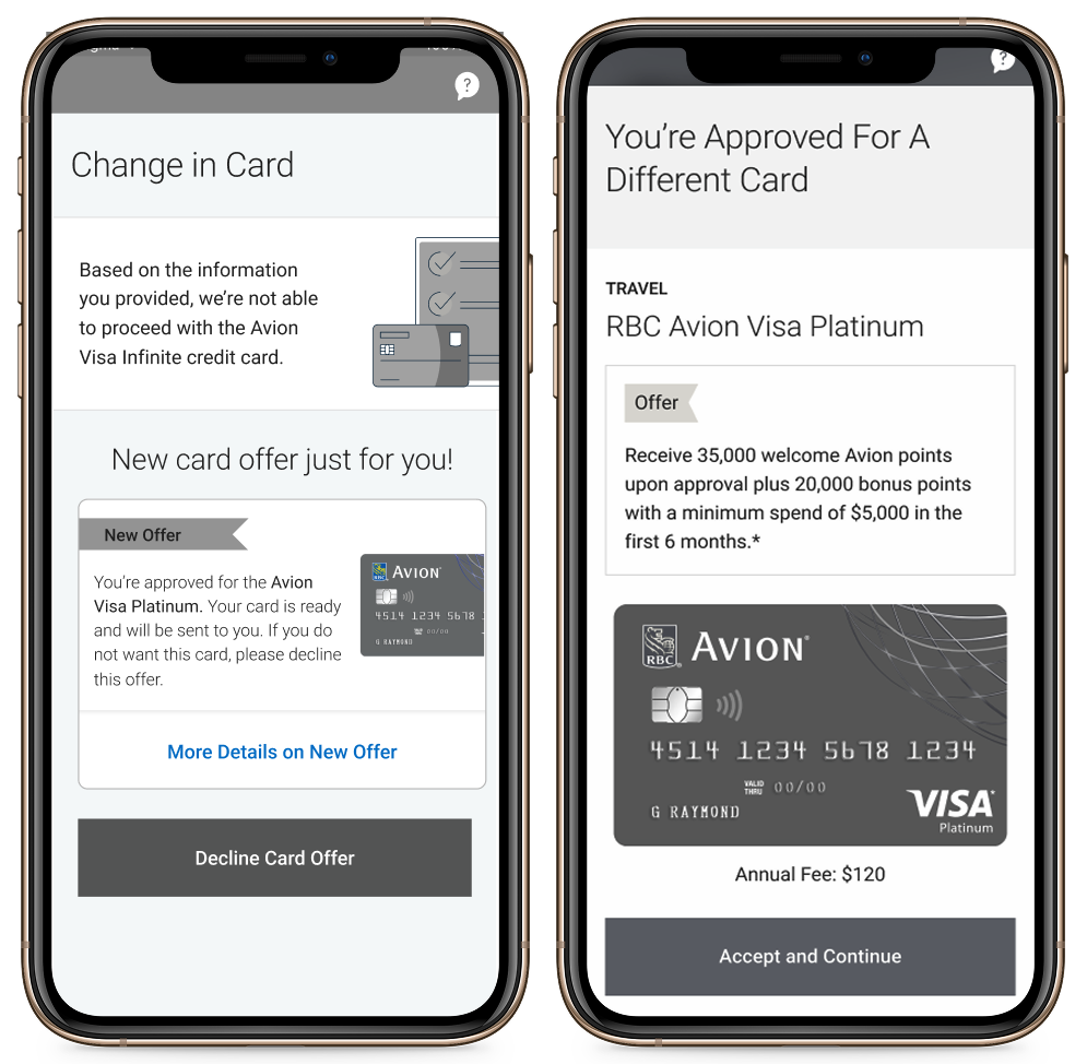
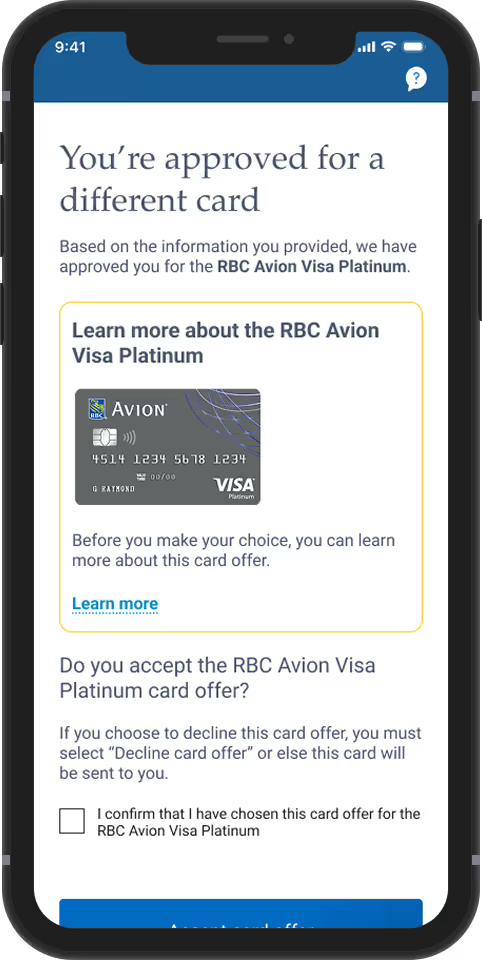
For this pre-approved offer there was a use case for users to be not be approved for the original offer after adjudication. However, instead of being fully declined users were given a downsell card, which carried less requirements for approval.

Downsell Research - Previous research was done on a downsell scenario, where they were told they were approved for the downsell option along with an image of the card. Users felt like they needed more information about the card, such as features and fees.

Downsell pain point - If a user is presented with the downsell card, they must decline the card or they will receive the card even if they exit the flow without taking any actions. To encourage the users to take an action and bring awareness, we introduced an intercept screen and communicated that the card has changed, hoping this would encourage users to feel compelled to understand what this means.