ONBOARDING

Multi-step card offer flow

A multi step card offer flow that address mutliple use cases to fulfilment

Introduction

As the Lead Product Designer, I spearheaded the end-to-end design of a credit card onboarding journey for existing retail clients. The primary challenge was a "Value Gap": while the business marketed a pre-approved offer, backend technical and regulatory requirements mandated a high-friction "adjudication" process involving hard credit checks and manual income verification.My goal was to bridge this gap—transforming a high-risk application flow into a seamless "confirmation" experience that protected the bank’s conversion targets while ensuring 100% legal and accessibility compliance.

Strategic Impact

Revenue Protection: Maintained conversion parity post-launch, despite the introduction of mandatory regulatory friction steps
.Systemic Scalability: Architected a reusable "Offer Pattern" now adopted by multiple lending teams across the bank to ensure cross-platform consistency.
Stakeholder Alignment: Navigated complex trade-offs between Legal, Engineering, and Marketing to simplify "Bill 101/96" and "Bill 151" requirements for mobile-native users.
Team Credit Cards - Consumer Banking (Cross-functional)
Role Lead Product Designer & Content Strategist. Supported research lead
Channel Mobile Native (Web-view) and Responsive Web
Constraints Adjudication latency, AODA/WCAG 2.1 Compliance, and multi-language (Quebec) legislation.

About card offer

PROBLEM

I was tasked with designing a pre-approved credit card onboarding journey for existing clients. The primary strategic challenge was a 'Trust Gap': the business promised a 'pre-approved' offer, but backend technical and regulatory requirements mandated a hard credit check and manual income verification. My goal was to navigate this friction—transforming a high-risk 'application' into a seamless 'confirmation' journey while protecting the bank's conversion metrics.
How might we maintain the 'Pre-Approved' value proposition while navigating mandatory legal friction and backend technical debt?

Design process

The design team along with Product conducted various exercises with cross-functional teams to ensure that we gathered as much insights as possible

STRATEGIC DISCOVERY

I initiated the discovery phase by auditing historical fulfillment data to pinpoint why users were dropping off in existing pre-approved flows. I synthesized these insights into an 'Opportunity Map' that balanced the bank’s need for data (adjudication) with the user's expectation of an instant 'pre-approved' experience.

First iteration design

Designed a 'happy path' user flow using the design library to illustrate a successful card approval journey, and presented it to internal stakeholders for experience alignment.

User testing

Collaborated with a lead researcher to develop research questions, conduct moderated interviews, analyze findings, and share insights with stakeholders.

Final Design

Final designs, informed by research findings, were shared with stakeholders and iterated to address legal requirements and technical constraints identified during design and development.

Product requirements & logic

Segmentation

Target: Clients <60 days with no existing credit card.

Lifecycle

90-day fulfillment window.

Logic

Dynamic card-family matching (Upsell/Downsell capability). Card offer code - Applies to a card or a family of cards only

Early iteration

I leveraged existing product data and fulfillment metrics to identify high-drop-off friction points. By auditing current production flows, I established a data-informed foundation for the MVP that prioritized immediate conversion wins while architecturalizing for post-launch scalability.

Research

Using the first iteration we conducted user testing to test our hypothesis. The research also helped us get a better understanding on what our users are expecting to see and how they react to certain pain points that we identified in our early explorations.
01

Misleading

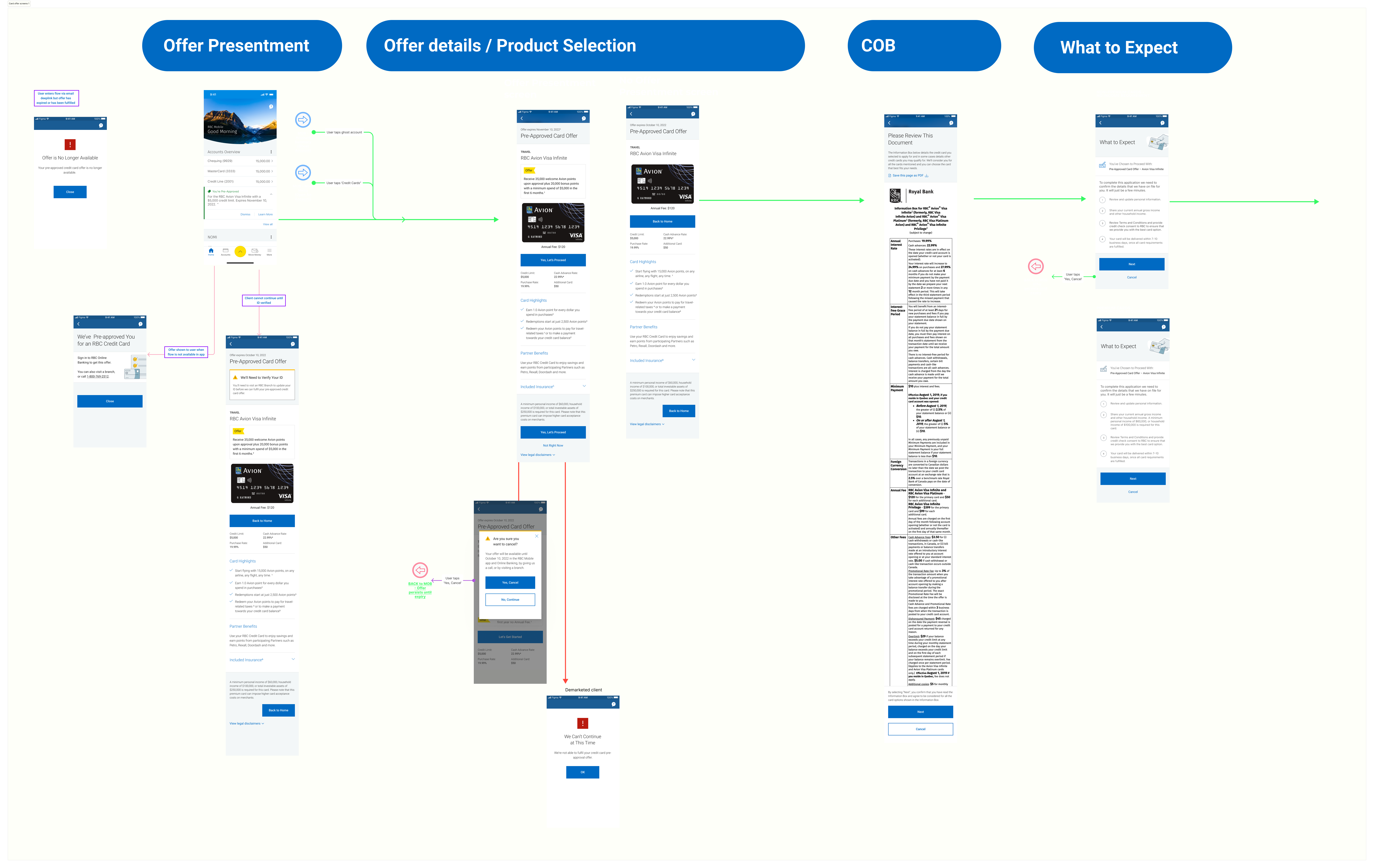
Users felt misled by the term Pre-Approved and as it did not align with their expectations. This was further emphasized by the "Apply" CTA, as users thought that they would simply just have to accept the card and that would be it.

Solution - pre-approved, is a term used across the bank, therefore removing the term was a problem beyond our work. Therefore, emphasis in seeing the value of the card through the content was emphasized. Also the term "apply" was removed and instead messaging around "proceeding" was used.

02

No interest

Users felt underwhelmed by "Using your Rewards". They felt it sounded like marketing and did not bring any tangible benefits that came with the card

Solution - Removed this and replaced with a more tangible benefits, which is mentioned further down.

03

Exhausting

Users felt after the adjudication screen the following screens seemed unnecessary and just made the flow seem tiresome to actually get the card.

Solution - consolidate some of the screens. In research, users were taken through the Upsell flow, where they were offered an upgraded card. We made it clear they we approved and allowed the user to continue with the original offer.

04

Overwhelmed

Users felt they only wanted tangible benefits. Benefits that they had to work towards did not appeal to them.

Solution - Balancing user needs and business needs provided direction in how to remove information but also how to ensure meeting business needs for certain information. A clear separation in the layout allowed offer content to be separated from actual features of the card.

05

Trust

The team expected users to be turned away by the credit bureau check, however, users who were versed in credit in Canada, understood it is part of the process and associated it to RBC looking out for their customers and ensuring they were eligible to take on the proposed credit limit and credit card.

06

Decision maker

Users were very interested in Partner Benefits, which was the very last screen. This component had a positive reaction from all users and they all mentioned that it was a deciding factor. Users mentioned that they would have liked to have seen it at the very start on the Presentment screen.

Solution - Partner Benefits was mentioned on the first screen. Brought in the Partner Benefits component to the "Approval" screen and changed the layout to a tile visual as Partner Benefits is expected to grow with more Partners over time.  

07

Hopeful

Prior to research, we had a hypothesis around users being put off that they had to apply for an assumed "pre-approved" credit card. The "what to expect" screen, met users expectations and relieved their initial apprehension. The next steps and the idea of the bank simply confirming their information was expected.

Full path - card offer

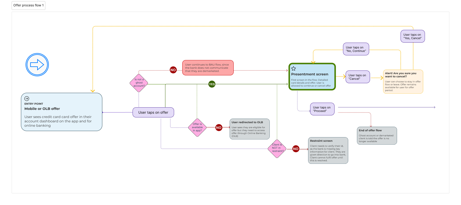
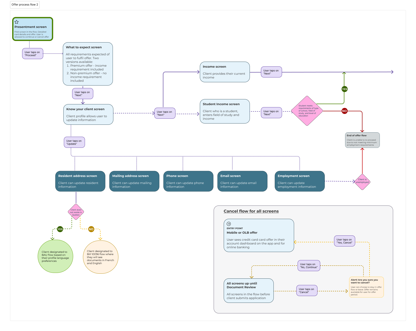
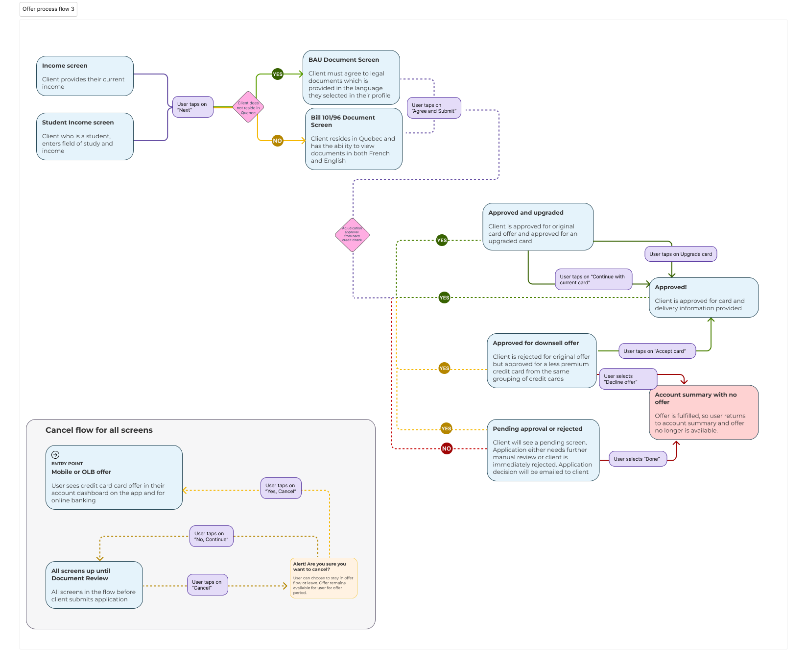
Clients are presented with the credit card offer both in the mobile app and online banking. Below outlines the different outcomes when a user selects the offer from their Account Summary page.

Refine & Iterate

Designed primarily for the mobile app (web view), collaborating closely with the mobile design team to ensure consistency in interactions and visuals across the app.

Additional use case requirements mid process

Throughout the process of building this product, new use cases were presented, some that affected all flows and some that specifically needed to be resolved for this card offer flow. At this stage, I was the main designer, which required working with related engineering teams, mobile design teams and mobile product, and various business and legal teams. Some of these use cases required repeated design reviews outside of the entire flow.
Demarketed clients - These are clients that have conducted fraudulent activities and the bank no longer wishes to do business with them.  
Clients in restraint - Clients are often missing certain id requirements on their active accounts. These offers are a great way to get their attention to come in to a branch and resolve their identification.
Offer not available in app - For various technical issues, the offer designated for the user may not be available in the app for the client to fulfil. Client will be guided to fulfil offer through their online banking (OLB)
Bill 151 - required all insurance certificates to be provided with an Insurance Summary document. This required replacing links to insurance certificates with insurance summaries, to avoid confusing the user, This regulation also had to be implemented in the agreement screen for user
Bill 101/96 - Built a funtionality that specifically as targeted to Quebec residents so bank remained compliant
The "Know your client" is a widget that was built by another team The widget did not include income, so income for both BAU and students needed to be included along with requirements to move forward.

Process Flow

This is the first part of the process flow for the Card offer flow. To see the screens to align with this flow you can view here > Screens for Process flow 1
This is the second part of the process flow for the Card offer flow. To see the screens to align with this flow you can view here > Screens for Process flow 2
This is the third part of the process flow for the Card offer flow. To see the screens to align with this flow you can view here > Screens for Process flow 3

Revisions

INITIAL FINAL SCREENS

  • After the adjudication screen users felt the final screens were too much
  • Partner benefits were highly popular among test users, with many citing them as a key deciding factor and recommending they be introduced earlier in the flow.
  • Tech limitations required 'set your preferences' to appear before the adjudication screen, creating an unusual experience where users had to select card delivery before approval.

REVISED FINAL SCREENS

  • Used the client’s previously set delivery preferences from their first account and provided an contact and reference information to update the delivery location if desired.
  • Partner benefits were highlighted on both the initial and final screens, with a tile format on the final screen to provide a clear, scalable view. This approach was well-received by stakeholders and, by using external links, avoided the need to include extensive legal disclaimers.
  • Consolidated all information into one screen and also removed some information from the initial final screen View final screen

Outliers - Upsell

For this pre-approved offer, there was a use case for users to be approved for a more premium card than the card they were approved for. While not all offers will have an upsell scenario, the few cards that did often come with a considerably higher annual fee. In looking at this, we came to the conclusion that we need to fully emphasize the value of that increased annual fee to encourage a user to accept the upgraded card over the current card.

To achieve a richer value proposition, a compare approach and emphasizing the premium features of the card were implemented.

Upsell pain point

Since users were being redirected from their original path, an upsell intercept screen was added to provide context and preserve user control, prioritizing their natural journey over pushing the upsell offer.

Research

The compare view screen performed exceptionally well in user testing, boosting decision confidence. Users recommended adding it to the initial offer screen, but current business and technical constraints prevent showing multiple cards during initial pre-approval.

Outliers - Downsell

In the pre-approved offer flow, users who were not approved after adjudication were offered a downsell card with lower approval requirements instead of being fully declined.

Downsell pain point

To ensure users were aware of receiving a downsell card by default unless declined, an intercept screen was introduced to highlight the card change and prompt user action.

Research

Previous research on the downsell scenario showed that users wanted more information—such as card features and fees—when presented with the downsell approval and card image.